Ultrablast is an iPhone game we have been working on for some time and decided to submit it to the IGF Mobile competition. Deadline: 1st of December. Hence mad scramble to polish everything up to the last possible moment. But we did it and it's looking pretty hot if I may say so myself. Please, check out the trailer and leave a comment on youtube, facebook, twitter etc!
Monday, 30 November 2009
Lots of things have happened
It's been a while since I posted anything here and there's a perfectly valid reason for that. Actually, make that several reasons! In no particular order:
- Got made a moderator/admin over at Game-Artist.net
Game Artist is a nice forum that is part of the CGSociety family and is (of course) geared towards game art. Feel free to drop in and post some work or help a struggling artist with a bit of constructive criticism.
- Resigned from Rebellion
While it was good fun to work with the people there, I felt it was time to move on. Will miss the people there though, great bunch of people.
- Got a job at Codemasters Southam
Somewhat nervous but they have put out some really good games and their tech looks like it can deliver so I'm excited to get my hands on that and getting involved in things over there.
- Found a flat in Leamington I really want to get my hands on
- Went to Stockholm, Sweden and...
- Celebrated 30th Birthday
- Went to see a couple of movies at the Stockholm Film Festival (their 20th Anniversary!)
Okuribito (Departures) - Japanese movie about a cellist whose orchestra gets disbanded and moves back to his small home town and gets a new job. Doesn't sound like much but it is easily one of the best movies I've seen in ages. Not a dry eye in the theatre when I watched it
Map of the Sounds of Tokyo - Tragic love story between a spanish wine seller and a fish market worker. Very good as well and since it's a Catalanian director it's got an interesting mix of European and Japanese vibes going on.
Haeundae - Korean disaster movie where I actually cared about the main characters. Good mix of comedy, drama, action and decent effects
Shrink - Kevin Spacey plays a self medicating shrink that tries to fix himself and his broken patients. It was better than I expected and has some sweet moments. And a decent ending too in my opinion.
The Limits of Control - Jim Jarmusch. Beautifully photographed but don't ask me to describe it...
And lastly...
Black Dynamite - Awesome stuff, a love letter to the blaxploitation genre. Completely crazy story too with a nice twist at the end. For your aural pleasure, they've gone and put the whole soundtrack online: http://www.blackdynamitemovie.com/music
- Writing notes on a blogpost about working abroad that I need to research a bit more before posting
- Helping out at GAMC #4, the Game Artist Mini Challenge
- Made a somewhat silly farewell letter together with a colleague
The way we did this was to create the template, print it out, tick the (in)appropriate boxes, get some coffe stains on it, fold it up and then scan it for some further touch ups and Bob's your uncle. Got a Photoshop psd template file if anyone wants to create their own letter...
So yeah, lots of stuff has been going on but it's calming down a bit now so I'm hoping I'll be able to post a bit more frequently again. And there's one last bit that I haven't shown... But will in a minute! Honest!
Monday, 26 October 2009
Fellow Developer Blogs
Since this blog is mostly about art I thought I'd share some links to a few blogs by other developers for those interested in what game development is like. There are quite a few developers blogging so this is just a small sample, there are a lot more out there that I haven't had time to read yet. Without further ado...
The Further Adventures of Oddbloke
A quite funny blog written by a programmer. Quite varied and this post does describe what it's like to work in a studio quite well: http://www.danceswithferrets.org/meeblog/?p=456
Raph Koster
Makers of Uplink, Darwinia and more talk about the development, the business of being an independent developer and they are very open about the cash flow problems they have faced and how they overcame them. Some really cool R&D there too!
Late additions:
The article linked above is titled "12 steps to Better Code" and while it's not games industry specific, it can probably benefit programmers, if nothing else as ammunition when talking to managment about improving procedures etc. Worth a read even if you're not a programmer since it will give you a better understanding of what they are up to over in the code-bay and why it might be a bad idea to interrupt them when they are working.
The Further Adventures of Oddbloke
A quite funny blog written by a programmer. Quite varied and this post does describe what it's like to work in a studio quite well: http://www.danceswithferrets.org/meeblog/?p=456
What Your Fellow Man is Capable Of
This is written by a gamedesigner and has some very insightful articles on what makes games fun. He also talks about how you can make a game more fun by paying attention to what's been done before and what actually works as well as other random bits and bobs
Japanmanship
Excellent blog about life and work for a westerner working in Japan. Sadly he hasn't updated it in a while but there is an extensive archive that is well worth reading if you are the least interested in working in Japan.
Double Fine
Not really a blog but Tim Schafer posts a lot of random stuff on the Double Fine News section which can be quite amusing. For example this post which shows some of his rejection letters and the completely awesome application that got him a job at Lucas Arts.
Warren Spector
Warren Spector is a legend and sadly he doesn't update all that often but it's still worth a look.
Raph Koster
Raph Koster has been working in this industry for a long time, mostly relating to Virtual Worlds and MMOs.
Introversion
Makers of Uplink, Darwinia and more talk about the development, the business of being an independent developer and they are very open about the cash flow problems they have faced and how they overcame them. Some really cool R&D there too!
There are tons more out there so go forth and explore the links from the blogs listed above!
Late additions:
Joel On Software
The article linked above is titled "12 steps to Better Code" and while it's not games industry specific, it can probably benefit programmers, if nothing else as ammunition when talking to managment about improving procedures etc. Worth a read even if you're not a programmer since it will give you a better understanding of what they are up to over in the code-bay and why it might be a bad idea to interrupt them when they are working.
Thursday, 1 October 2009
Creating metal surfaces
wrote this short text some time ago to help people when they were creating metal surfaces and thought it could do with being reposted here. I've also added a section on reflections at the end so without further ado...
Creating metal surfaces
This is just a couple of things I keep in mind when creating metal surfaces. They are by no means set in stone, it's just a few things I've noticed might help when creating metal surfaces for next (well, current really) gen use.
The most common problem with normalmaps for metal is that it's easy to overdo it. Depending on the engine you are using, you might not be able to get sharp, crisp normalmaps unless you use fairly large texture sheets so for the most part, the fine grainy detail will have to be left to the specular. Scratches and such do work however and usually need to be in the normalmap to make it look convincing (just keep in mind that texture compression might ruin the really fine scratches, those that are just one or two pixels wide).
Below is a compilation of different types of painted metal surfaces:
As you can see, painted metal can look very different depending on what type of paint it is and what it has been subjected to. It's important to decide what type of paint your surface has been painted with since it will affect both the normal and the specular maps. Having a history in mind when you create the textures is useful since it will help you decide how to treat it. Is it an old surface with lots of scratches, new with a few dents, so old the paint has started to flake, was it painted without being cleaned up first so you have really lumpy paint, has it been polished often? Having a history will also make the object look a bit more interesting rather than "generic metal box #6". This is of course not mandatory, it's just a mental exercise that might help when creating the textures. I should add that having a history in mind works for any kind of texturing, not just metal surfaces.
A common mistake is to create a normalmap that has a lot of noise in it but this makes the surface look more like leather/elephant hide than metal. If the texture is a 2048 instead of say, a 1024, the noise might have looked more like the grainy paint above but in most cases, it won't look like convincing metal. What I would do is to tone the noise down considerably and just keep the scratches where the paint has been scratched away to reveal the metal. What we need to keep in mind however, is that scratches that are just a few pixels wide will most likely look lumpy and not very pretty once the texure has been compressed. So keep larger scrathes, dents etc in the normalmap but be careful with the finer detail.
In addition to that, a specular with fairly high contrast can work well since paint is usually fairly matte and non-reflective (there are of course exceptions, it is as always down to what type of surface you want to mimic) whereas scratches can be very shiny since the metal surface beneath the paint shows through. Another little tweak can be to make the diffuse colder. Sometimes a texture can have a fairly warm feel, with brown and almost light orange tones as a base which can make it feel slightly wooden. By simply changing the hue on the base colour layers so they are more blue-tinted it can feel more metal-y. It's a cheap trick but it works. It is also important to tweak the specular curve of your material since the way a game engine renders the light shining on your material can have a large impact in addition to your textures.
When it comes to the specular, it's almost better to put a lot of the fine detail there rather than in the normalmap for the reasons outlined above. Some detail needs to be in the normalmap and mimicked in the specularmap, such as scratches while otheres shouldn't be in the specular at all. One such example is if you have a plain metal surface that has been dented. Again, this depends on what kind of effect you want. If it's a recent dent, there won't have been time for dirt and dust to collect so it hasn't become dull yet. If it's an old dent, it will be less shiny than the surrounding areas since it won't have been cleaned as well as the rest of the surface. And just to add to the confusion, some things should be in the specular but not the normalmap such as oily surfaces, grease marks, handprints etc. This is where the idea of having a history of the objects comes in handy again. Has the object been manhandled a lot, dropped, left to stand in an oilslick etc. All these things combine to make the surface look interesting and if you put the right detail in the right map, it will look fantastic.
Of course, metals need to reflect something so having a good reflection map is the last piece of the puzzle. Here is where it can come down more to what looks good than what it would realistically reflect. Unless your surface is very clean you can get away with using a reflection that doesn't have anything to do with the setting. As long as it looks good, that's all that matters. It's also down to memory usage. If you take a cubemap for example, it's made from six separate images so the memory usage is fairly large for just a single cubemap. If you can reuse one cubemap on many surfaces you'll save memory which can then be spent on other things, such as higher resolution textures on selected objects. As always it's a trade off between what looks good and how much memory you have left for the shiny stuff. That's also why slightly dirty, painted metals is a bit easier to cheat with, you won't get a clear image of what the reflection looks like. Clean environments are always harder to get to look good and interesting in my opinion. By the way, a very good example of succesful clean environments is Mirrors Edge, it has great usage of lighting and a very clean style. Well worth a look for the visuals alone (apart from some of the fighting sequences, it's a good game in my opinion).
Since this whole text is about metal surfaces, I have to mention Dead Space. It has a very well designed look and the way they use specular and normalmaps in that game is almost exemplary of how to do metal surfaces right. The normalmaps are clean, crisp and there is very rarely any noise in them. It is a very well made game, excellent design on pretty much all levels. Great atmosphere, lighting, texturing and a good story with good voice acting. Speical mention goes to the integrated HUD and the sound design as it is, in one word; amazing. Playing it with headphones late at night was an expereince I won't forget any time soon. As an example of Dead Space texturing (and a cheap way to get more images into this post), here are two screenshots that show their restrained normalmaps and nice use of specular. It looks a lot better in motion, and the lighting is pretty much all dynamic so you'll see some really nice effects all through the game
Until next time...
Wednesday, 23 September 2009
Helpful Scripts That Help
One thing that helps a lot when working on environments are handy scripts. I've written a couple that some of us use at work that I thought I'd share and explain a bit about how they save time. We use 3dsmax so these are all macroscripts (except one) that you can bind to a hotkey, saving lots of clicking in the ui by automating some functions and adding some that you couldn't bind to hotkeys. If you want to find more scripts for 3dsmax, Scriptspot is an awesome resource. It's been around for ages and has a huge stack of scripts for almost anything you can think of. Two scripts that I always install wherever I go are Meshtools and CsPolytools, exceptionally useful for modeling, I could live without them but it would be a sad sad world. Now on to the scripts!
Macroscripts
Macroscripts go into the 3dsmax\ui\macroscripts folder. You can find these tools under "Urgaffel"
This particular script goes into 3dsmax\scripts\startup.
These are just a few ways that I've tried to save some time by minimizing the ammount of clicking an artist has to do to perform simple, repetitive tasks. Personally I prefer to work with hotkeys since I won't have to hunt around in menus for the tools I need. It lets me keep the focus on the model and have the tools do the work instead of me working to find the tools! I hope you enjoy using them.
The scripts are provided as is and I take no responsibility for anything unexpected that might happen. They've been used in production and we haven't encountered any problems but just in case something does go wrong, please don't sue me :)
Macroscripts
Macroscripts go into the 3dsmax\ui\macroscripts folder. You can find these tools under "Urgaffel"
- urg_backfacecull.mcr - Toggles backface culling on and off for all selected objects. Usefull when you've imported a bunch of objects and you need to flip them. Also unifies the selection so if some objects are toggled on and some off, this is a quick way of making them all have the same setting.
- urg_bridge.mcr - This one is pretty neat if I may say so myself. It allows you to bind the Bridge command to a hotkey and will automatically adjust to the sub-object you are using (edge/border/face) and ignore everything else. For some reason the Bridge command isn't in the hotkey list so a co worker wondered if I could write a script which I gladly did.
- urg_centerpivot.mcr - Does pretty much what it says, it centeres the pivot on all selected objects.
- urg_originpivot.mcr - Moves the pivot point of selected objects to the origin, 0,0,0. Can be handy when you are exporting props to a game engine and you want the pivot to be on the "ground"
- urg_resetxconvert.mcr - Resets x-form on all selected objects and then converts them to editable poly. Saves time when you have been moving, scaling and rotating things and just want a quick reset. Serves a similar function to Mayas Freeze transform if I remember correctly.
- urg_uvwboxmap4.mcr - Applies a 4m x 4m x 4m box mapping modifier to selected polygons and selected objects. This is very very useful when roughing out an environment and you want to slap some textures on to see what it looks like. In most cases, using a 1024 texture for 4m is ok so you get a consistent pixel density as well. With a little bit of tweaking, you can have near final quality uv mapping in no time.
This particular script goes into 3dsmax\scripts\startup.
- urg_viewportsettings.ms - The same co worker who I wrote the Bridge script for wanted this little script so that 3dsmax would always start with the same layout and viewport settings. It's a simple script that can be easily adapted to whatever a person would want layout-wise, as long as there is a command for it.
These are just a few ways that I've tried to save some time by minimizing the ammount of clicking an artist has to do to perform simple, repetitive tasks. Personally I prefer to work with hotkeys since I won't have to hunt around in menus for the tools I need. It lets me keep the focus on the model and have the tools do the work instead of me working to find the tools! I hope you enjoy using them.
The scripts are provided as is and I take no responsibility for anything unexpected that might happen. They've been used in production and we haven't encountered any problems but just in case something does go wrong, please don't sue me :)
Sunday, 13 September 2009
"The Unspoken Truth About Managing Geeks" - Excellent article
A poster over at The ChaosEngine (a forum for people working in the gamesindustry, more about that below) posted a link to this article about managing geekss in IT companies and it is a very good read. It definitely applies to the gamesindustry as well and I've seen this happen in companies were I've worked. Makes me wish managment teams all over would read this and take at least some of it, if not all, to heart. Pretty much everyone I've talked to that have read it agrees that it's pretty much spot on! So, without further ado, here's the article:
The ChaosEngine
The ChaosEngine is a very good forum for people who work in the games industry. It has a private section where you have to prove that you are a developer before you can join it. The way to do this is to send a mail using your work email and if possible, to get another developer already registered on the forum to vouch for you. If you work in the games industry, you could do a lot worse than to join, it's an excellent place to talk about the industry without worrying about rabid fanboys butting in and just have a good time with fellow developers. A lot of information is avaliable there, from art to programming to managment and business advice as well as information about various companies. It also works as a watercooler where you post stupid/fun/cool/useful links and articles, such as the one above!
As an example of what this community has accomplished, the Tim Langdell and Mobigames dispute over the name "Edge" (and if you haven't heard of this, where have you been?). The blog ChaosEdge will hopefully be familiar to you since they've been posting a lot of interseting information regarding the case. It is maintained by a few people from The ChaosEngine and a lot of the stuff that has been dug up on Tim Langdell has been done by the excellent internet sleuths over at the forum. In short, it's a pretty awesome place.
Thursday, 3 September 2009
Attitude and Criticism
One thing you will face as an artist in the games industry is criticism. It's unavoidable. Your co-workers will tear your work apart, your leads will tear your work apart and your art director will tear your work apart. Maybe not devastatingly so, but they will still find things you can improve and undoubtedly you will be told to change things. So the right attitude is pretty important, on both sides if you want to keep the artists at least civil with eachother. Giving and being able to take criticism is probably one of the most important skills to have in order to stay moderately sane when working in this industry since you are working with a group of creative people who (hopefully) want to create the best looking game that they can.
In order to do so we try to help and push eachother to new heights and there will inevitably be occasions when someone will look at your screen and, depending on their social skills, say anything from "That's shit" to "Looks good, but you could chage that bit to this and this bit here to that, could be cool" to "The publisher has changed the date, we need to cut this down". That last one is especially fun. What I'm getting at is that no piece of work survives contact with your co-workers so being able to distance yourself from your work is very important. I'm not saying don't be passionate about what you are doing, you have to be if you want to be good but don't let your work equal your self esteem. I've seen a lot of young (and not so young) artists starting out and as soon as someone points out a flaw get very defensive and try to fob it off with "It's supposed to look like that, his nose was grafted on after a dog bit it off and the doctor was a cross-eyed drunk with parkinsons so he couldn't do it very well so that's why the nose looks like that, be quiet". Which isn't really helping anyone. Of course, you don't have to rely on your co-workers since there are a few simple ways to check your own work. One of them is to just mirror whatever you're working on, either in your tools or by looking at it in a mirror. After a while your brain gets used to the way things are placed in relation to eachother so flipping it will force your brain to re-evaluate the image, helping you spot flaws or maybe if you nudge that bit there a bit to the left it will look even better. Or you can flip it upside down. Another way is to play with colourschemes, again forcing your brain to refresh.
Being able to look at your work with critical eyes and a bit of distance is going to help you in the long run and make you a better artist. Being able to look at other peoples work and point out things that could be better in a nice way is also something that will help you in the long run, especially on the social side. As an example, CGTalk has battled with this for some time, on how to get people to give constructive criticism instead of the usual "AWESOME!!!11" and "That's shit!" and it's just as important, if not more so in a studio. You don't want your co-workers seeing you as an obnoxious idiot so when commenting on peoples work it's a good idea to articulate why something is great/shit and what could change. Preferably at the same time. Criticism is usually absorbed a bit easier if you point out something that is good at the same time as you point out something that is bad. Of course, once you get to know the poeple you work with you will know who you can walk up to and say "Jesus, what the hell did you do to that?!" and have a laugh and who is a bit more sensitive about their work where a more diplomatic approach is needed. I'm not saying you have to be overly nice about it but you do need to be honest. If you give honest criticism and explain why and perhaps think of a few ways it can be improved, people will (hopefully) appreciate it more. When you ask for advice they will hopefully treat you the same way since that is the best way to improve. Being nice to someone can actually do more damage than good in some cases. Tell the truth, but do it in a polite way and you get the best of both worlds. There's no need to put someone down just because they made a mistake, that is not constructive and will only generate ill will which might come back and bite you later.
Speaking of attitudes, having an open mind towards new techniques, tools and programs is really important in my opinion. In this industry the technology is always evolving and there's almost always something new popping up that looks cool and interesting so to dismiss it wihtout giving it a look seems counterproductive to me. On one hand it's easy to get stuck in your ways and not really try to evolve ("it works for me and I'm happy with it") which isn't necessarily a bad thing in itself but it does mean you can get left behind in a way. Take the not so recent transition where we started to use normalmaps. It's been used in games for at least 4-5 years by now but there are still games where the normalmaps are a mess. Wether this is due to lack of knowledge or lack of passion, the result is the same, it looks like crap. Having an interest in learning and sharing the knowledge is as much as anyone can do since you can't actually force anyone to learn new stuff unless they want to (well if you're the lead/AD you can force them...) and it will show that you're trying to improve both yourself and the general quality of work which you will hopefully be encouraged to. There are of course places where this isn't appreciated or might even be actively discouraged but you can't win all the time.
In conclusion, being able to give constructive criticism is very important as is being able to take it on board. Having an attitude of "I'm the greatest thing since sliced bread!" and ignoring what your co-workers are saying isn't going to do you any favours. Being open to knowledge no matter the source and being willing to share is the way to go. This might be a bit obvious to you but from what I've seen and heard, it really isn't that apparent to people that we are evolving as an industry every day, every week. New tools, new ideas and new processes will always come along and complement the old ways. Being able to seize on these and bend them to your will is not a bad thing and it saddens me when people treat them with suspicion. Don't fear the change!
Last of all, I want to apologize for the lack of images. This is supposed to be an art related blog and no images? Shame on me.
-Day after posting edit-
I remembered a few other ways to refresh your brain in regards to your own work. Taking a break if you can is a good way (look at this addendum as an example). A coffee break or ever better, a day or two without looking at it will make you come back to it and see it in a new light. Of course, in the games industry you are usually working to deadlines so being able to leave something alone for a day or two isn't always possible. If you're working on a texture, taking a step back and unfocusing your eyes will draw your attention to areas that stand out. If you're doing a 3d model, assigning it a completely black material will allow you to focus on the silhouette, making it easier to see how your model reads from a distance without any detail to distract the eyes. Team Fortress 2 is worth noting in this since each of the nine classes have distinctly different silhouettes. You can spot which class you're up against from a mile off thanks to the excellent character design. The Australian painter Bob Abrahams has a long list of things you can do to re-evaluate your work on his blog, worth a look if you want to read more about tricking your brain.
Worth noting is that this being the games industry, odds are you'll be revisiting things you've created in the past to give them a bit of extra polish and to optimize the assets. For example, those 16 sided cylinders that seemed a good idea at the time has turned into a problem and needs to be reduced to 6-8 sides. This is again something you'll get used to, things inevitably change. The only thing we as artists can do is to try and do the best job we can with the information we have, accept the changes imposed on us with dignity and then have a rant at the pub after work. In an ideal world we wouldn't have to change our work but then again, changes where you can add more detail and polish isn't always bad. The kind where you have to chop a couple of levels up and mash the pieces into a new one is less fun however but sadly it happens. In the end you'll just have to roll with it (but no one says you have to like it).
Monday, 31 August 2009
Island Lighthouse - Concepts part 2.5
Just a very quick and dirty mockup in UE3 too get to know the editor again. It's been a while since I used it so this is good practice, even though it doesn't look all that awesome...
If you want to get a job in the games industry, knowing how to use one of the readily avaliable editors is a good thing to have on your CV. Choices include Unreal Editor 3 (Unreal Tournament 3), Sandbox 2 (Crysis), Source (Halflife 2, Team Fortress 2) and the Enemy Territory: Quake Wars editor. There are of course a lot more than that you can experiment with such as Unity, Torque3D and even Blender. And of course, there are the in-house engines that a company might use instead but those you will get to learn on the job. But the good thing is, if you have shown that you can learn how to use a freely avaliable editor, odds are you will be able to learn the in-house one too. And of course you'll be more interesting to a studio that uses an editor you know how to use so it's a win win situation. At it's most extreme, it can be the difference between getting a job and not.
If you want to get a job in the games industry, knowing how to use one of the readily avaliable editors is a good thing to have on your CV. Choices include Unreal Editor 3 (Unreal Tournament 3), Sandbox 2 (Crysis), Source (Halflife 2, Team Fortress 2) and the Enemy Territory: Quake Wars editor. There are of course a lot more than that you can experiment with such as Unity, Torque3D and even Blender. And of course, there are the in-house engines that a company might use instead but those you will get to learn on the job. But the good thing is, if you have shown that you can learn how to use a freely avaliable editor, odds are you will be able to learn the in-house one too. And of course you'll be more interesting to a studio that uses an editor you know how to use so it's a win win situation. At it's most extreme, it can be the difference between getting a job and not.
Sunday, 30 August 2009
Island Lighthouse - Concepts part 2 + doodle
Did some more doodling, just testing things in my mind. I think I will have time to do a proper 3d blockout/whitebox in UE this (extended!) weekend so hopefully I will be updating again before too long. The big question now is how big to make the island. Just a slip of a rock with a lighthouse like in the earlier concepts or slightly larger with a few trees, a beach etc. I'm leaning towards slightly bigger since it will be possible to add more stuff but at the same time, does it really need to be bigger with more stuff? And that is why a 3d blockout will help, to see what works and what doesn't. Now for images!
And a completely unrelated doodle, inspired by reading Tom Sawyer.
All the doodles were drawn in my little Moleskin notebook and (badly) photographed with the built-in webcamera on my laptop so please forgive the quality :)
And a completely unrelated doodle, inspired by reading Tom Sawyer.
All the doodles were drawn in my little Moleskin notebook and (badly) photographed with the built-in webcamera on my laptop so please forgive the quality :)
Sunday, 23 August 2009
Consistency and Efficiency
One of the problems when creating environments (and any kind of assets really) is to keep things consistent, especially if you have more than one person working on a project. When I say consistency I mean the general feel and design of a scene, level or asset. Texturing, lighting, modeling, shading and all the other little bits that go in to creating these little works. The reason for this post is a question I got asked on CgTalk and it's an intersting one since in theory it should be quite simple, especially if it's just one person doing the creating. However, in reality it isn't always so easy, especially as your team grows.
For the single artist working on a scene it is usually fairly straight forward to keep things consistent since it's just you and you have your own workflow. But even then you tend to develop your techniques as you go along which can introduce slight inconsistencies in your work. For example, take a project I've been working on for some time, a 2d shooter. I started out with one style in mind and created a few ships along the guidelines I had set myself. However, after a couple of ships, the style started changing as I tried new ideas and approaches. After a month or so, the new ships looked nothing like the old ones which led to more work since I had to redo the old assets. This is of course my own fault since I could've stuck with the original style but truth be told, it didn't really work so it was a good thing the style changed.
So where am I going with this? The importance of concepts and style studies/guides can never be overestimated. Had I done proper concepting and tried out various styles in the beginning I might not have had to redo those ships. The fact that it is 2d doesn't really matter since the same principle applies to 3d as well. It's easy to get excited when you have an idea and just get stuck in with the modeling but what might happen is that you start to flounder a bit later on when the intial idea has been brewing in your head for a while. It starts to change and you might think of new things to add. Slowly your intital idea will evolve into something else and that's can of course be a good thing. But it's usually a bit more efficient to do this evolving on the concept stage since it's a lot faster to do simple drawings instead of modeling an environment. And realising halfway through that you're not sure where you are going or that the first part you made doesn't actually fit with where you're going now can be really frustrating and in the worst case mean that you just drop it.
The same idea is even more important when you have a group of people working together on environments or a bunch of assets. Having concepts that you can refer to, quick mood paintings with colour schemes, detail studies to show the more intricate parts and surface types is worth its weight in gold. And to bring it all together, a Lead Artist or for larger teams an Art Director that can guide the rest of the team towards a common style. The Lead or AD needs to have a vision of how the different parts will come together and be able to guide the rest of the team towards that vision because if they don't, our personal styles will undoubtedly start to make their mark on the stuff we produce and you'll get a disjointed feeling to the visuals. Some parts might look a bit like, say, Call of Duty whereas another part might look more like Killzone or Half Life 2. I'm not advocating that a Lead should walk around with a whip, forcing each artist to obey his every whim but rather that the Lead/AD will keep an eye on what is produced so they can step in and nudge people in the right direction before it would have to be completely redone. Especially before things are commited as a final version in your source control there needs to be some sort of sign off.
To go back to the single artists working on a scene, this is one of the things I'm trying to do with my island project. To go through each step along the way and hopefully end up with a nice little scene in the end and a decent example of a thorough workflow. It does mean it takes a bit longer to have something to put in an engine but I think that the time I save later on when I would usually be at a loss as to what to do is worth the work in the beginning. A good example of the ideas above is Bram Eulaers Unearhly Challenge winning piece: Abandoned. Below you can see the concepts and paintovers as well as the final result.
He has some very nice examples of environments where he shows the concept that comes first and then the finished 3d environment, it's definitely worth having a look at his site if you haven't seen it before.
Monday, 17 August 2009
Amazing artist
Completely not related to anything environment arty, but worth a post anyway. Jesse Turner is a great artist who has a ton of llustrations online, have a look: Massive art dump
Very cool style, crazy colouring and awesome ideas all in one big heap, makes me want to take them all, create them in 3d and animate them!
Very cool style, crazy colouring and awesome ideas all in one big heap, makes me want to take them all, create them in 3d and animate them!
Saturday, 15 August 2009
Island Lighthouse - Concepts
This is the beginning of my Island Lighthouse.
I thought I'd share all the steps I go through to take an environment from idea to finish and the first step apart form having an idea, is concept art. I started by having a look at some lighthouses online using Google and flickr (among others) to get some reference on what kind of lighthouses there are and maybe some environments. I did have a pretty clear image in my head when I started so this was just to see if there were any neat elements I could use.
The next step was to start drawing and trying to capture what I had in my mind. These drawings are just quick doodles to help you shape your idea, to see where it takes you, not something you have to stick to to the bitter end. The first image I did was literally a 5 minute Photoshop sketch with some crazy colours.
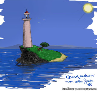
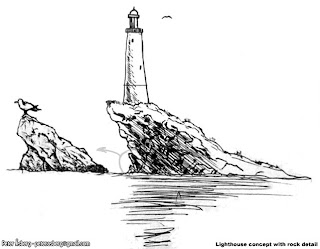
While not pretty, it sets the mood somewhat. Blue sky, sunlight, a blue sea and distant lands on the horizon. A rocky side and a nicer, sandy side. With that done, I switched to good old pen and paper, or in my case, ballpoint pen and paper (Muji black 0.5mm ballpoint, they just feel good). One thing among many that I learned at Vancouver Film School was to do a larger drawing and then do detail studies of parts of it which is what I did with the image below. The rock on the left is a way for me to explore what I want the rock to look like without over-detailing the main image. Seagulsl are always nice and handy as a size reference too.
With that done, time for some more interesting perspectives and again, some details to see what kind of materials the lighthouse would be built with for example.
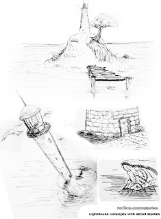
Adding in various details such as seagulls and the fish brings it to life a bit and also helps set a mood that I would like to try and achieve in the final scene. And it's good practice too, even if they are really simple.
I thought I'd share all the steps I go through to take an environment from idea to finish and the first step apart form having an idea, is concept art. I started by having a look at some lighthouses online using Google and flickr (among others) to get some reference on what kind of lighthouses there are and maybe some environments. I did have a pretty clear image in my head when I started so this was just to see if there were any neat elements I could use.
The next step was to start drawing and trying to capture what I had in my mind. These drawings are just quick doodles to help you shape your idea, to see where it takes you, not something you have to stick to to the bitter end. The first image I did was literally a 5 minute Photoshop sketch with some crazy colours.

While not pretty, it sets the mood somewhat. Blue sky, sunlight, a blue sea and distant lands on the horizon. A rocky side and a nicer, sandy side. With that done, I switched to good old pen and paper, or in my case, ballpoint pen and paper (Muji black 0.5mm ballpoint, they just feel good). One thing among many that I learned at Vancouver Film School was to do a larger drawing and then do detail studies of parts of it which is what I did with the image below. The rock on the left is a way for me to explore what I want the rock to look like without over-detailing the main image. Seagulsl are always nice and handy as a size reference too.

With that done, time for some more interesting perspectives and again, some details to see what kind of materials the lighthouse would be built with for example.

Adding in various details such as seagulls and the fish brings it to life a bit and also helps set a mood that I would like to try and achieve in the final scene. And it's good practice too, even if they are really simple.
Friday, 14 August 2009
Portfolio - Part 3
With the games over and done with, on to personal projects and some traditional art (with some nudity).
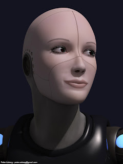
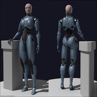
First up is a female robot, modeled and rendered in 3dsmax (as is most of what I've worked on). The original design came from Francis Tsai. Sadly I have lost the original concept due to moving around and leaving computers and harddrives behind.
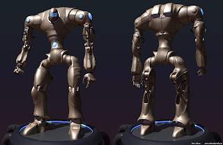
This male robot is my own design and as the female, modeled and rendered in 3dsmax with mental ray. Good old fashioned sub d modeling all the way with a few splines for the tubes.
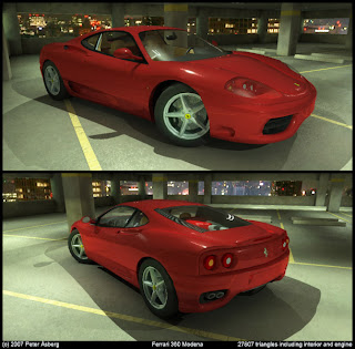
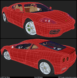
The Ferrari is about 30 000 triangles, rendered with mental ray. The background is a panorama taken from the Tokyo Tower when I was visiting Japan a couple of years back.
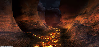
A small lava scene where pretty much all the materials are procedurals. The only texture I used was a simple mask for the water, the rest is all vertex colours, noise and gradients.
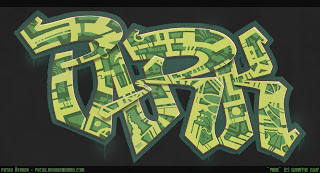
This was just a quick graffitti piece I did for fun. Could be used as a decal in a city scene for example
This very wide image is four sides of a cubemap I created for a project me and a couple of friends were working on. It was supposed to be a 3rd person space shooter where you could fly in any direction, blowing things up.

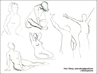
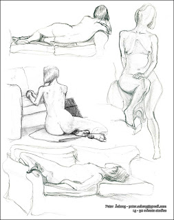
Now for some more traditional art. These are mostly of recent lifedrawings and one set of older images from whne I was attending the Intensive Drawing Workshop at Vancouver Film School. Sadly the image with my lifedrawings form VFS isn't of the highest quality as all I had access to at the time was a mobile phone camera. The lifedrawings themselves are made with graphite, HB pencils and charcoal, ranging from 30 seconds to 30 minutes.
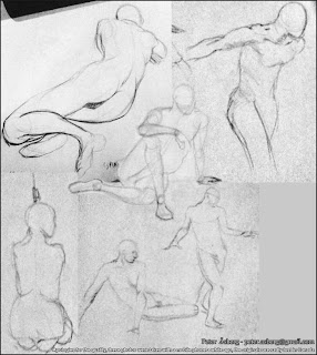
And that concludes the portfolio part for now. I have worked on two more projects, Battlefront - Elite Squadron and Rogue Warrior but I can't publish any images of what I have done on these projects just yet. So there will be a Portfolio - Part 4 later on.
Next I will start posting the progress on a small scene I plan to do in Unreal, taking it from idea to final product via concept, reference gathering, modeling and all the other bits that go into the making of a small environment. Hopefully it will be useful for any aspiring environment artists out there.
First up is a female robot, modeled and rendered in 3dsmax (as is most of what I've worked on). The original design came from Francis Tsai. Sadly I have lost the original concept due to moving around and leaving computers and harddrives behind.


This male robot is my own design and as the female, modeled and rendered in 3dsmax with mental ray. Good old fashioned sub d modeling all the way with a few splines for the tubes.

The Ferrari is about 30 000 triangles, rendered with mental ray. The background is a panorama taken from the Tokyo Tower when I was visiting Japan a couple of years back.


A small lava scene where pretty much all the materials are procedurals. The only texture I used was a simple mask for the water, the rest is all vertex colours, noise and gradients.

This was just a quick graffitti piece I did for fun. Could be used as a decal in a city scene for example

This very wide image is four sides of a cubemap I created for a project me and a couple of friends were working on. It was supposed to be a 3rd person space shooter where you could fly in any direction, blowing things up.

Now for some more traditional art. These are mostly of recent lifedrawings and one set of older images from whne I was attending the Intensive Drawing Workshop at Vancouver Film School. Sadly the image with my lifedrawings form VFS isn't of the highest quality as all I had access to at the time was a mobile phone camera. The lifedrawings themselves are made with graphite, HB pencils and charcoal, ranging from 30 seconds to 30 minutes.


And that concludes the portfolio part for now. I have worked on two more projects, Battlefront - Elite Squadron and Rogue Warrior but I can't publish any images of what I have done on these projects just yet. So there will be a Portfolio - Part 4 later on.
Next I will start posting the progress on a small scene I plan to do in Unreal, taking it from idea to final product via concept, reference gathering, modeling and all the other bits that go into the making of a small environment. Hopefully it will be useful for any aspiring environment artists out there.
Portfolio - Part 2
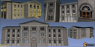
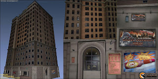
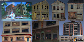
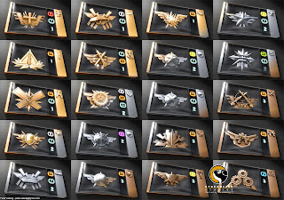
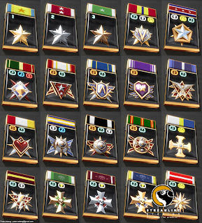
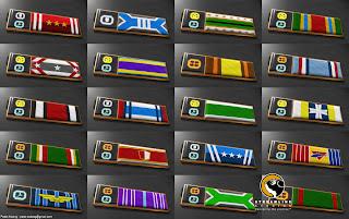
The second part of my recent portfolio contains images from Saints Row and medals from Battlefield 2142.
Saints Row - Volition, THQ
I mainly worked as a texture artist on this project with some modeling, testing and various other roles thrown in for good measure.
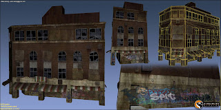
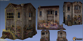
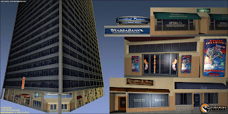

Battlefield 2142 - DICE, EA
This project was probably the most challenging one I've worked on so far. Around 250 images, from scratch in about 6 weeks, with a unified look and feel. My best friend became the Action button in Photoshop which was a lifesaver for making sure each image had the right layers, colour correction and effects.
Saints Row - Volition, THQ
I mainly worked as a texture artist on this project with some modeling, testing and various other roles thrown in for good measure.


Battlefield 2142 - DICE, EA
This project was probably the most challenging one I've worked on so far. Around 250 images, from scratch in about 6 weeks, with a unified look and feel. My best friend became the Action button in Photoshop which was a lifesaver for making sure each image had the right layers, colour correction and effects.


Friday, 7 August 2009
Portfolio - Part 1
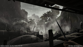
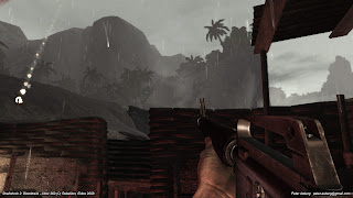
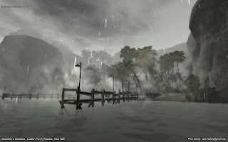
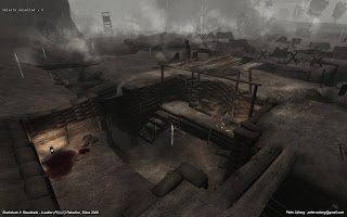
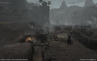
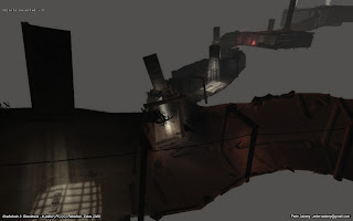
Shellshock 2 - Rebellion, Eidos
On this game I worked mainly on the third mission, doing modeling, texturing, botanical placement and tweaking, lighting and a various other random things. I was also involved in helping out on various other levels but since M03 was my main focus, that is what is shown here. It is a mix of PC and 360 screenshots, each image being marked which.
Overlord - Triumph Studios, Codemasters
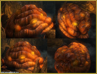
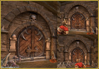
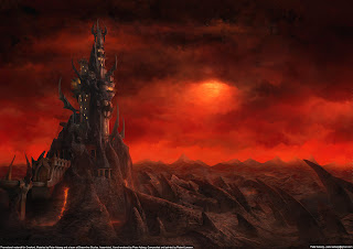
When I worked at Streamline Studios I worked on Overlord, creating a bunch of art for it. Sadly I don't have any nice renders of that stuff so I have had to resort to in-game screenshots. Below is just a fraction of what I worked on at that project. Responsibilities included modeling, texturing, sculpting, assembling the tower hub, testing tools and helping to develop the pipeline etc.
Next part will be some older projects I worked on: Battlefield 2142 and Saints Row.
On this game I worked mainly on the third mission, doing modeling, texturing, botanical placement and tweaking, lighting and a various other random things. I was also involved in helping out on various other levels but since M03 was my main focus, that is what is shown here. It is a mix of PC and 360 screenshots, each image being marked which.


Overlord - Triumph Studios, Codemasters
When I worked at Streamline Studios I worked on Overlord, creating a bunch of art for it. Sadly I don't have any nice renders of that stuff so I have had to resort to in-game screenshots. Below is just a fraction of what I worked on at that project. Responsibilities included modeling, texturing, sculpting, assembling the tower hub, testing tools and helping to develop the pipeline etc.


Next part will be some older projects I worked on: Battlefield 2142 and Saints Row.
Subscribe to:
Comments (Atom)


