I thought I'd share all the steps I go through to take an environment from idea to finish and the first step apart form having an idea, is concept art. I started by having a look at some lighthouses online using Google and flickr (among others) to get some reference on what kind of lighthouses there are and maybe some environments. I did have a pretty clear image in my head when I started so this was just to see if there were any neat elements I could use.
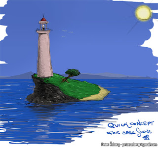
The next step was to start drawing and trying to capture what I had in my mind. These drawings are just quick doodles to help you shape your idea, to see where it takes you, not something you have to stick to to the bitter end. The first image I did was literally a 5 minute Photoshop sketch with some crazy colours.

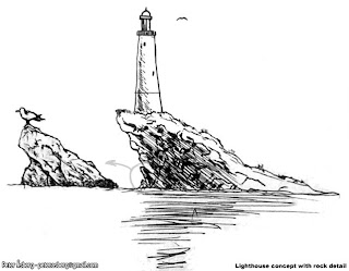
While not pretty, it sets the mood somewhat. Blue sky, sunlight, a blue sea and distant lands on the horizon. A rocky side and a nicer, sandy side. With that done, I switched to good old pen and paper, or in my case, ballpoint pen and paper (Muji black 0.5mm ballpoint, they just feel good). One thing among many that I learned at Vancouver Film School was to do a larger drawing and then do detail studies of parts of it which is what I did with the image below. The rock on the left is a way for me to explore what I want the rock to look like without over-detailing the main image. Seagulsl are always nice and handy as a size reference too.

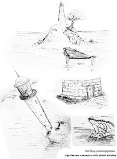
With that done, time for some more interesting perspectives and again, some details to see what kind of materials the lighthouse would be built with for example.

Adding in various details such as seagulls and the fish brings it to life a bit and also helps set a mood that I would like to try and achieve in the final scene. And it's good practice too, even if they are really simple.
I think you can really push the concept further, making the tree bigger and more prominent and perhaps get some nice shadow play from the crown.
ReplyDeleteHere's some inspiration -- http://1.bp.blogspot.com/_YObE6Gx77AM/Sobh2kzCU5I/AAAAAAAAATo/yUGSf20nEk4/s1600-h/island01.jpg
It looks very coasy though, I get ghibli vibes:)
Good Luck ~B