Just a very quick and dirty mockup in UE3 too get to know the editor again. It's been a while since I used it so this is good practice, even though it doesn't look all that awesome...
If you want to get a job in the games industry, knowing how to use one of the readily avaliable editors is a good thing to have on your CV. Choices include Unreal Editor 3 (Unreal Tournament 3), Sandbox 2 (Crysis), Source (Halflife 2, Team Fortress 2) and the Enemy Territory: Quake Wars editor. There are of course a lot more than that you can experiment with such as Unity, Torque3D and even Blender. And of course, there are the in-house engines that a company might use instead but those you will get to learn on the job. But the good thing is, if you have shown that you can learn how to use a freely avaliable editor, odds are you will be able to learn the in-house one too. And of course you'll be more interesting to a studio that uses an editor you know how to use so it's a win win situation. At it's most extreme, it can be the difference between getting a job and not.
Monday, 31 August 2009
Sunday, 30 August 2009
Island Lighthouse - Concepts part 2 + doodle
Did some more doodling, just testing things in my mind. I think I will have time to do a proper 3d blockout/whitebox in UE this (extended!) weekend so hopefully I will be updating again before too long. The big question now is how big to make the island. Just a slip of a rock with a lighthouse like in the earlier concepts or slightly larger with a few trees, a beach etc. I'm leaning towards slightly bigger since it will be possible to add more stuff but at the same time, does it really need to be bigger with more stuff? And that is why a 3d blockout will help, to see what works and what doesn't. Now for images!
And a completely unrelated doodle, inspired by reading Tom Sawyer.
All the doodles were drawn in my little Moleskin notebook and (badly) photographed with the built-in webcamera on my laptop so please forgive the quality :)
And a completely unrelated doodle, inspired by reading Tom Sawyer.
All the doodles were drawn in my little Moleskin notebook and (badly) photographed with the built-in webcamera on my laptop so please forgive the quality :)
Sunday, 23 August 2009
Consistency and Efficiency
One of the problems when creating environments (and any kind of assets really) is to keep things consistent, especially if you have more than one person working on a project. When I say consistency I mean the general feel and design of a scene, level or asset. Texturing, lighting, modeling, shading and all the other little bits that go in to creating these little works. The reason for this post is a question I got asked on CgTalk and it's an intersting one since in theory it should be quite simple, especially if it's just one person doing the creating. However, in reality it isn't always so easy, especially as your team grows.
For the single artist working on a scene it is usually fairly straight forward to keep things consistent since it's just you and you have your own workflow. But even then you tend to develop your techniques as you go along which can introduce slight inconsistencies in your work. For example, take a project I've been working on for some time, a 2d shooter. I started out with one style in mind and created a few ships along the guidelines I had set myself. However, after a couple of ships, the style started changing as I tried new ideas and approaches. After a month or so, the new ships looked nothing like the old ones which led to more work since I had to redo the old assets. This is of course my own fault since I could've stuck with the original style but truth be told, it didn't really work so it was a good thing the style changed.
So where am I going with this? The importance of concepts and style studies/guides can never be overestimated. Had I done proper concepting and tried out various styles in the beginning I might not have had to redo those ships. The fact that it is 2d doesn't really matter since the same principle applies to 3d as well. It's easy to get excited when you have an idea and just get stuck in with the modeling but what might happen is that you start to flounder a bit later on when the intial idea has been brewing in your head for a while. It starts to change and you might think of new things to add. Slowly your intital idea will evolve into something else and that's can of course be a good thing. But it's usually a bit more efficient to do this evolving on the concept stage since it's a lot faster to do simple drawings instead of modeling an environment. And realising halfway through that you're not sure where you are going or that the first part you made doesn't actually fit with where you're going now can be really frustrating and in the worst case mean that you just drop it.
The same idea is even more important when you have a group of people working together on environments or a bunch of assets. Having concepts that you can refer to, quick mood paintings with colour schemes, detail studies to show the more intricate parts and surface types is worth its weight in gold. And to bring it all together, a Lead Artist or for larger teams an Art Director that can guide the rest of the team towards a common style. The Lead or AD needs to have a vision of how the different parts will come together and be able to guide the rest of the team towards that vision because if they don't, our personal styles will undoubtedly start to make their mark on the stuff we produce and you'll get a disjointed feeling to the visuals. Some parts might look a bit like, say, Call of Duty whereas another part might look more like Killzone or Half Life 2. I'm not advocating that a Lead should walk around with a whip, forcing each artist to obey his every whim but rather that the Lead/AD will keep an eye on what is produced so they can step in and nudge people in the right direction before it would have to be completely redone. Especially before things are commited as a final version in your source control there needs to be some sort of sign off.
To go back to the single artists working on a scene, this is one of the things I'm trying to do with my island project. To go through each step along the way and hopefully end up with a nice little scene in the end and a decent example of a thorough workflow. It does mean it takes a bit longer to have something to put in an engine but I think that the time I save later on when I would usually be at a loss as to what to do is worth the work in the beginning. A good example of the ideas above is Bram Eulaers Unearhly Challenge winning piece: Abandoned. Below you can see the concepts and paintovers as well as the final result.
He has some very nice examples of environments where he shows the concept that comes first and then the finished 3d environment, it's definitely worth having a look at his site if you haven't seen it before.
Monday, 17 August 2009
Amazing artist
Completely not related to anything environment arty, but worth a post anyway. Jesse Turner is a great artist who has a ton of llustrations online, have a look: Massive art dump
Very cool style, crazy colouring and awesome ideas all in one big heap, makes me want to take them all, create them in 3d and animate them!
Very cool style, crazy colouring and awesome ideas all in one big heap, makes me want to take them all, create them in 3d and animate them!
Saturday, 15 August 2009
Island Lighthouse - Concepts
This is the beginning of my Island Lighthouse.
I thought I'd share all the steps I go through to take an environment from idea to finish and the first step apart form having an idea, is concept art. I started by having a look at some lighthouses online using Google and flickr (among others) to get some reference on what kind of lighthouses there are and maybe some environments. I did have a pretty clear image in my head when I started so this was just to see if there were any neat elements I could use.
The next step was to start drawing and trying to capture what I had in my mind. These drawings are just quick doodles to help you shape your idea, to see where it takes you, not something you have to stick to to the bitter end. The first image I did was literally a 5 minute Photoshop sketch with some crazy colours.
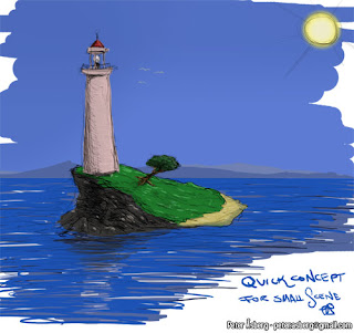
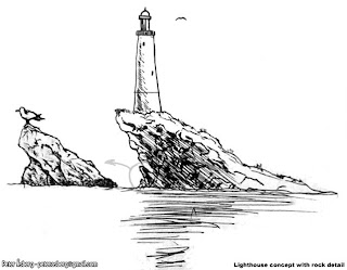
While not pretty, it sets the mood somewhat. Blue sky, sunlight, a blue sea and distant lands on the horizon. A rocky side and a nicer, sandy side. With that done, I switched to good old pen and paper, or in my case, ballpoint pen and paper (Muji black 0.5mm ballpoint, they just feel good). One thing among many that I learned at Vancouver Film School was to do a larger drawing and then do detail studies of parts of it which is what I did with the image below. The rock on the left is a way for me to explore what I want the rock to look like without over-detailing the main image. Seagulsl are always nice and handy as a size reference too.
With that done, time for some more interesting perspectives and again, some details to see what kind of materials the lighthouse would be built with for example.
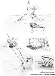
Adding in various details such as seagulls and the fish brings it to life a bit and also helps set a mood that I would like to try and achieve in the final scene. And it's good practice too, even if they are really simple.
I thought I'd share all the steps I go through to take an environment from idea to finish and the first step apart form having an idea, is concept art. I started by having a look at some lighthouses online using Google and flickr (among others) to get some reference on what kind of lighthouses there are and maybe some environments. I did have a pretty clear image in my head when I started so this was just to see if there were any neat elements I could use.
The next step was to start drawing and trying to capture what I had in my mind. These drawings are just quick doodles to help you shape your idea, to see where it takes you, not something you have to stick to to the bitter end. The first image I did was literally a 5 minute Photoshop sketch with some crazy colours.

While not pretty, it sets the mood somewhat. Blue sky, sunlight, a blue sea and distant lands on the horizon. A rocky side and a nicer, sandy side. With that done, I switched to good old pen and paper, or in my case, ballpoint pen and paper (Muji black 0.5mm ballpoint, they just feel good). One thing among many that I learned at Vancouver Film School was to do a larger drawing and then do detail studies of parts of it which is what I did with the image below. The rock on the left is a way for me to explore what I want the rock to look like without over-detailing the main image. Seagulsl are always nice and handy as a size reference too.

With that done, time for some more interesting perspectives and again, some details to see what kind of materials the lighthouse would be built with for example.

Adding in various details such as seagulls and the fish brings it to life a bit and also helps set a mood that I would like to try and achieve in the final scene. And it's good practice too, even if they are really simple.
Friday, 14 August 2009
Portfolio - Part 3
With the games over and done with, on to personal projects and some traditional art (with some nudity).
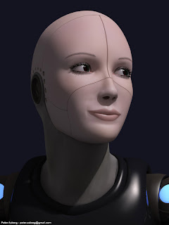
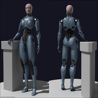
First up is a female robot, modeled and rendered in 3dsmax (as is most of what I've worked on). The original design came from Francis Tsai. Sadly I have lost the original concept due to moving around and leaving computers and harddrives behind.
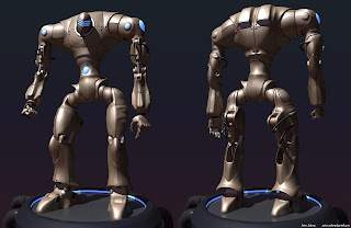
This male robot is my own design and as the female, modeled and rendered in 3dsmax with mental ray. Good old fashioned sub d modeling all the way with a few splines for the tubes.
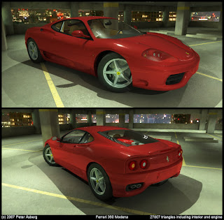
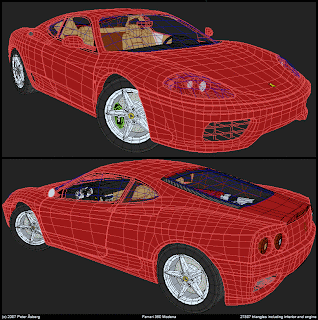
The Ferrari is about 30 000 triangles, rendered with mental ray. The background is a panorama taken from the Tokyo Tower when I was visiting Japan a couple of years back.
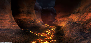
A small lava scene where pretty much all the materials are procedurals. The only texture I used was a simple mask for the water, the rest is all vertex colours, noise and gradients.
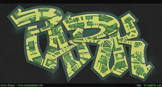
This was just a quick graffitti piece I did for fun. Could be used as a decal in a city scene for example
This very wide image is four sides of a cubemap I created for a project me and a couple of friends were working on. It was supposed to be a 3rd person space shooter where you could fly in any direction, blowing things up.

Now for some more traditional art. These are mostly of recent lifedrawings and one set of older images from whne I was attending the Intensive Drawing Workshop at Vancouver Film School. Sadly the image with my lifedrawings form VFS isn't of the highest quality as all I had access to at the time was a mobile phone camera. The lifedrawings themselves are made with graphite, HB pencils and charcoal, ranging from 30 seconds to 30 minutes.
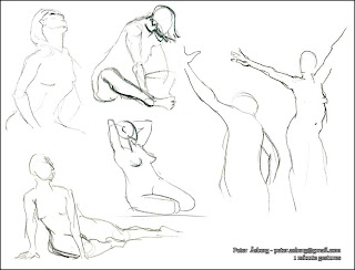
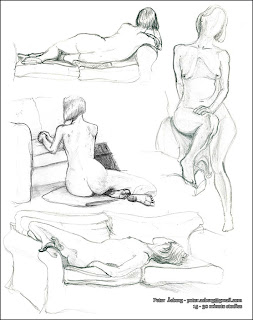
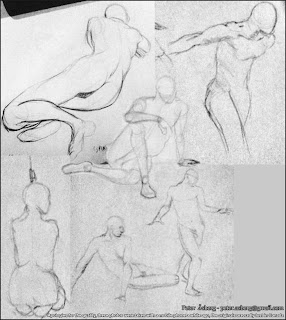
And that concludes the portfolio part for now. I have worked on two more projects, Battlefront - Elite Squadron and Rogue Warrior but I can't publish any images of what I have done on these projects just yet. So there will be a Portfolio - Part 4 later on.
Next I will start posting the progress on a small scene I plan to do in Unreal, taking it from idea to final product via concept, reference gathering, modeling and all the other bits that go into the making of a small environment. Hopefully it will be useful for any aspiring environment artists out there.
First up is a female robot, modeled and rendered in 3dsmax (as is most of what I've worked on). The original design came from Francis Tsai. Sadly I have lost the original concept due to moving around and leaving computers and harddrives behind.


This male robot is my own design and as the female, modeled and rendered in 3dsmax with mental ray. Good old fashioned sub d modeling all the way with a few splines for the tubes.

The Ferrari is about 30 000 triangles, rendered with mental ray. The background is a panorama taken from the Tokyo Tower when I was visiting Japan a couple of years back.


A small lava scene where pretty much all the materials are procedurals. The only texture I used was a simple mask for the water, the rest is all vertex colours, noise and gradients.

This was just a quick graffitti piece I did for fun. Could be used as a decal in a city scene for example

This very wide image is four sides of a cubemap I created for a project me and a couple of friends were working on. It was supposed to be a 3rd person space shooter where you could fly in any direction, blowing things up.

Now for some more traditional art. These are mostly of recent lifedrawings and one set of older images from whne I was attending the Intensive Drawing Workshop at Vancouver Film School. Sadly the image with my lifedrawings form VFS isn't of the highest quality as all I had access to at the time was a mobile phone camera. The lifedrawings themselves are made with graphite, HB pencils and charcoal, ranging from 30 seconds to 30 minutes.


And that concludes the portfolio part for now. I have worked on two more projects, Battlefront - Elite Squadron and Rogue Warrior but I can't publish any images of what I have done on these projects just yet. So there will be a Portfolio - Part 4 later on.
Next I will start posting the progress on a small scene I plan to do in Unreal, taking it from idea to final product via concept, reference gathering, modeling and all the other bits that go into the making of a small environment. Hopefully it will be useful for any aspiring environment artists out there.
Portfolio - Part 2
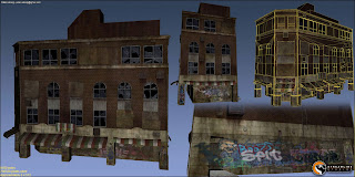
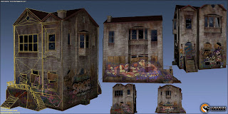
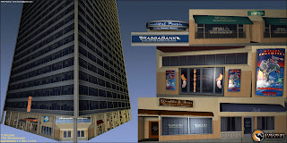
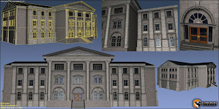
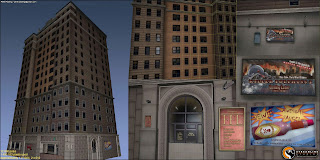
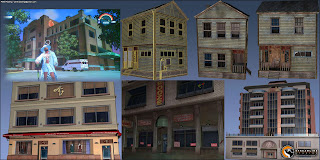
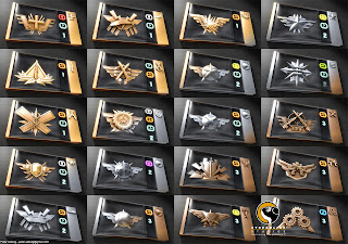
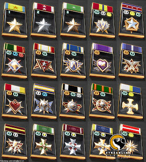
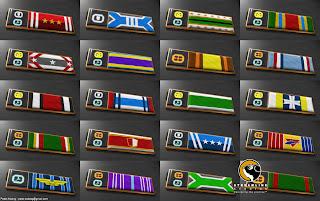
The second part of my recent portfolio contains images from Saints Row and medals from Battlefield 2142.
Saints Row - Volition, THQ
I mainly worked as a texture artist on this project with some modeling, testing and various other roles thrown in for good measure.

Battlefield 2142 - DICE, EA
This project was probably the most challenging one I've worked on so far. Around 250 images, from scratch in about 6 weeks, with a unified look and feel. My best friend became the Action button in Photoshop which was a lifesaver for making sure each image had the right layers, colour correction and effects.
Saints Row - Volition, THQ
I mainly worked as a texture artist on this project with some modeling, testing and various other roles thrown in for good measure.


Battlefield 2142 - DICE, EA
This project was probably the most challenging one I've worked on so far. Around 250 images, from scratch in about 6 weeks, with a unified look and feel. My best friend became the Action button in Photoshop which was a lifesaver for making sure each image had the right layers, colour correction and effects.


Friday, 7 August 2009
Portfolio - Part 1
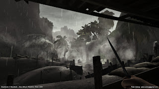
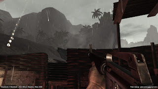
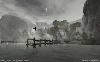
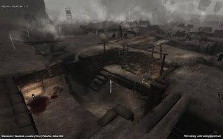
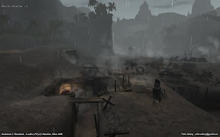
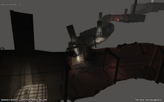
Shellshock 2 - Rebellion, Eidos
On this game I worked mainly on the third mission, doing modeling, texturing, botanical placement and tweaking, lighting and a various other random things. I was also involved in helping out on various other levels but since M03 was my main focus, that is what is shown here. It is a mix of PC and 360 screenshots, each image being marked which.
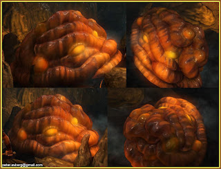
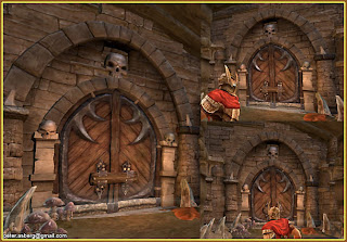
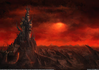
Overlord - Triumph Studios, Codemasters
When I worked at Streamline Studios I worked on Overlord, creating a bunch of art for it. Sadly I don't have any nice renders of that stuff so I have had to resort to in-game screenshots. Below is just a fraction of what I worked on at that project. Responsibilities included modeling, texturing, sculpting, assembling the tower hub, testing tools and helping to develop the pipeline etc.
Next part will be some older projects I worked on: Battlefield 2142 and Saints Row.
On this game I worked mainly on the third mission, doing modeling, texturing, botanical placement and tweaking, lighting and a various other random things. I was also involved in helping out on various other levels but since M03 was my main focus, that is what is shown here. It is a mix of PC and 360 screenshots, each image being marked which.


Overlord - Triumph Studios, Codemasters
When I worked at Streamline Studios I worked on Overlord, creating a bunch of art for it. Sadly I don't have any nice renders of that stuff so I have had to resort to in-game screenshots. Below is just a fraction of what I worked on at that project. Responsibilities included modeling, texturing, sculpting, assembling the tower hub, testing tools and helping to develop the pipeline etc.


Next part will be some older projects I worked on: Battlefield 2142 and Saints Row.
Subscribe to:
Comments (Atom)


